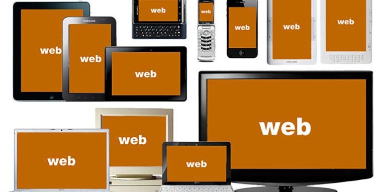
By responsive web design or development we understand a web layout which is easy reading and navigation with a minimum of
re-sizing, panning, and scrolling across a wide range of devices like as desktop monitor, tablet and mobile. We can
compare responsive website contents with water which can easily go with the containers.
Web design/ develop responsive layouts using different ways. We make flexible contents and images by using different
things. The most popular way is Bootstrap framework and also CSS3 @media queries.
We can easily develop responsive website layouts with Bootstrap ( 12 grid layout web framework ) and @media queries.
Bootstrap is free to use framework and it’s website provides all details description how to use
it. Beside Bootstrap, we need to use @media queries also to make some custom changes in different devices. We can use any
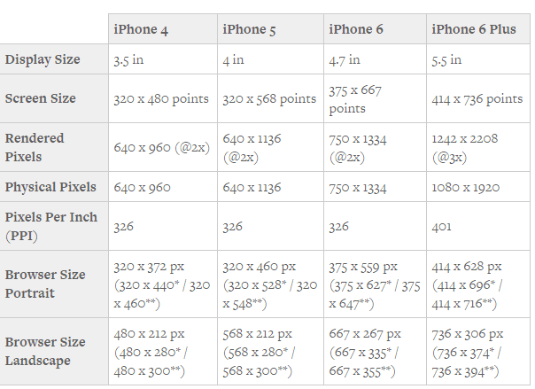
dimension for various devices that’s why you need to know the size of the devices and use specific dimension for specific
devices specially mobile devices which are very sensitive and the iPhones which are more sensitive. Let’s see dimensions
of iPhones till now.
Considering all the dimensions of all devices we need to use proper queries as the layout becomes flexible in all
devices. I use @media queries in five steps like below considering all devices and I suggest it to use in responsive
layouts.
/* Extra Small Portrait ( covering all mobile devices portrait)*/
@media (max-width: 479px) {}
/* Extra Small (covering all mobile devices landscape and small tablets portrait)*/
@media (min-width: 480px) and (max-width: 767px) {}
/* Small Devices (covering tablets)
@media (min-width: 768px) and (max-width: 991px) {}
/* Medium desktop devices */
@media (min-width: 992px) and (max-width: 1199px) {}
/*Large and Extra large desktop devices */
@media (min-width: 1200px) {}
By using these @media queries and Bootstrap, I make 100% responsive layouts. If you like you can try this.
Thank you.


