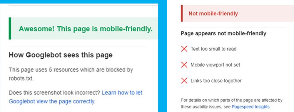
This discussion is about how to make your website mobile friendly and pass your website in mobile friendly test of google webmaster mobile frienly test. A mobile friendly website contents, features, structure and styles are captured perfectly by mobile browsers and these things can not be captured perfectly by mobile browsers which website is not mobile friendly.
If your current website is not mobile friendly and failed in mobile friendly test of google webmaster mobile friendly
test or you want to create a new website which you want to make mobile friendly, then this article is going to help you.
Before reading this full article you should read the older article > “Easiest Way To Make Your Website Mobile
Friendly.
Now in this article you are going to see how to make your website mobile friendly by custom coding.
To make your website mobile friendly and pass it mobile friendly test in google webmaster testing, you must make your website 100% responsive or flexible with mobile devices and make sure it is in validated HTML5 structure.
This article will help you to make your website responsive or flexible in different devices > Responsive Web Design / Development
After making your website 100% responsive make sure you set the charset and viewport// in the head section by meta tag like below
<meta charset="UTF-8">
<meta name="viewport" content="width=device-width, initial-scale=1.0">
Remember, the head section must be W3C validated HTML5 and make sure you used DOCTYPE html.
Then Use THML5shiv and respond.js in commented way in your head section like below.
<!--[if lt IE 9]>
<script src="html5shiv.js"></script>
<script src="respond.min.js"></script>
<![endif]-->
I suggest you to use modernizr.js also in your head section, but it’s not mandatory.
finally your head section will be like this below.
<head>
<meta charset="UTF-8">
<meta name="viewport" content="width=device-width, initial-scale=1.0">
<meta name="description" content="">
<link rel="stylesheet" href="style.css">
<script src="modernizr.js"></script>
<!--[if lt IE 9]>
<script src="html5shiv.js"></script>
<script src="respond.min.js"></script>
<![endif]-->
</head>
And the beginning of the page(before head section) you must set html5 structure perfectly like below.
<!DOCTYPE html>
<html lang="en">
After setting the head section like this of your responsive website, check it again and it will be 100% mobile friendly
and pass mobile friendly test of google webmaster test.


